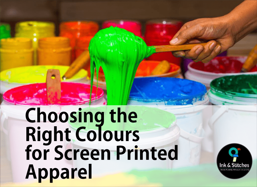
The Art of Color in Custom Apparel
When it comes to creating eye-catching screen-printed apparel, choosing the right colour plays a crucial role. Whether you’re a business owner looking to promote your brand or a fashion enthusiast seeking to make a statement, understanding the nuances of colour choices can significantly impact the final product’s appeal and effectiveness.
Understanding Color Psychology
Colours evoke emotions and convey messages. Before selecting colours for your screen-printed apparel, consider the following:
- Red: Energetic and bold
- Blue: Trustworthy and calming
- Green: Natural and refreshing
- Yellow: Cheerful and optimistic
- Purple: Luxurious and creative
Understanding these associations can help you align your colour choices with your intended message or brand identity.
Fabric Color Considerations
The base colour of your apparel serves as the foundation for your design. Keep these points in mind:
- Light fabrics allow for more colour options in printing
- Dark fabrics may require an underbase for vibrant colours
- Neutral colours like white, black, or grey offer versatility
Tip: Consider how your design will contrast with the fabric colour for maximum impact.
Design Contrast and Readability
Ensuring your design stands out is paramount. Here are some strategies to achieve optimal contrast:
Color Pairing
- Use complementary colours for a striking effect
- Employ analogous colours for a harmonious look
- Experiment with monochromatic schemes for sophistication
Text Legibility
When incorporating text, maintain readability by:
- Using high-contrast color combinations
- Avoiding busy patterns behind text
- Selecting appropriate font sizes and styles
Ink Considerations for Vibrant Printing
The type of ink used in screen printing affects colour vibrancy and durability. Consider:
- Plastisol inks for bright, opaque colours
- Water-based inks for a soft, vintage feel
- Specialty inks for unique effects (e.g., metallic, glow-in-the-dark)
Trend-Conscious Color Selection
Stay current with colour trends to appeal to fashion-forward consumers. Research colour forecasts in the apparel industry and consider incorporating:
- Seasonal color palettes
- Pantone Color of the Year
- Industry-specific colour trends
Testing and Sampling
Before finalizing your colour choices, it’s advisable to:
- Request physical colour swatches
- Order sample prints
- Test different colour combinations
This process ensures the final product meets your expectations and resonates with your target audience.
Conclusion
Selecting the right colours for screen-printed apparel involves a combination of art, science, and strategy. By considering colour psychology, fabric interactions, design principles, and current trends, you can create custom apparel that not only looks great but also effectively communicates your intended message. Remember to always test your designs and consult with experienced screen printing professionals to achieve the best results.


